Risk-Reward Plots
library(tidyverse)  # Load ggplot2, dplyr, and all the other tidyverse packages
library(mosaic)
library(ggthemes)
library(lubridate)
library(fivethirtyeight)
library(here)
library(skimr)
library(janitor)
library(vroom)
library(tidyquant)
library(tidytext)
library(rvest)    # scrape websites
library(purrr)
library(lubridate) #to handle dates
library(plyr)
library(dplyr)
Returns of financial stocks
#loading the data
nyse <- read_csv(here::here("data","nyse.csv"))

glimpse(nyse)
## Rows: 508
## Columns: 6
## $ symbol <chr> "MMM", "ABB", "ABT", "ABBV", "ACN", "AAP", "AFL", "A", …
## $ name <chr> "3M Company", "ABB Ltd", "Abbott Laboratories", "AbbVie…
## $ ipo_year <chr> "n/a", "n/a", "n/a", "2012", "2001", "n/a", "n/a", "199…
## $ sector <chr> "Health Care", "Consumer Durables", "Health Care", "Hea…
## $ industry <chr> "Medical/Dental Instruments", "Electrical Products", "M…
## $ summary_quote <chr> "https://www.nasdaq.com/symbol/mmm", "https://www.nasda…Based on this dataset, create a table and a bar plot that shows the number of companies per sector, in descending order
companies_per_sector <- nyse %>%
                        dplyr::group_by(sector) %>%
                        dplyr::count(sort = TRUE) %>%
                        select(sector, number = n)
companies_per_sector
## # A tibble: 12 x 2
## # Groups: sector [12]
## sector number
## <chr> <int>
## 1 Finance 97
## 2 Consumer Services 79
## 3 Public Utilities 60
## 4 Capital Goods 45
## 5 Health Care 45
## 6 Energy 42
## 7 Technology 40
## 8 Basic Industries 39
## 9 Consumer Non-Durables 31
## 10 Miscellaneous 12
## 11 Transportation 10
## 12 Consumer Durables 8comp_per_sector_plot <- ggplot(companies_per_sector,
aes(y = reorder(sector, number),
x = number,
fill = factor(sector)))+
geom_bar(stat = "identity")+
theme(axis.text.x=element_text(angle=0),
legend.position = 'none') +
labs(x = "Sector",
y = "Number of Companies",
title = "The Finance Sector dominates by far in the NYSE")
comp_per_sector_plot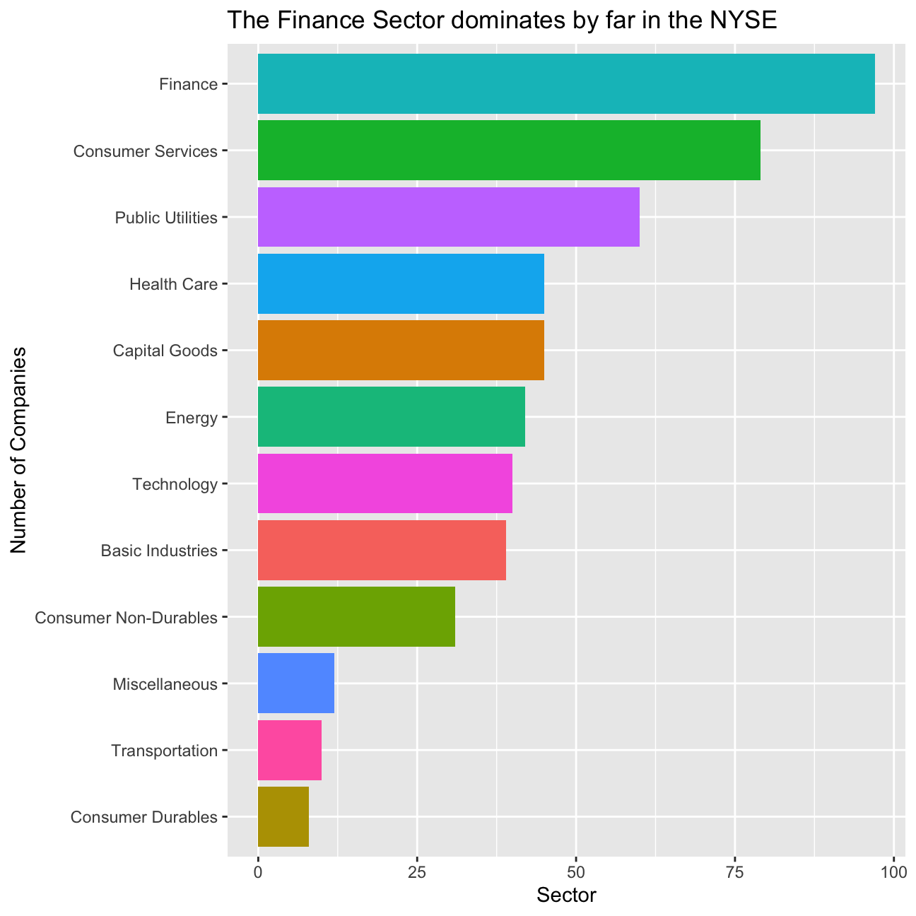
Next, let’s choose the Dow Jones Industrial Aveareg (DJIA) stocks and their ticker symbols and download some data. Besides the thirty stocks that make up the DJIA, we will also add SPY which is an SP500 ETF (Exchange Traded Fund).
djia_url <- "https://en.wikipedia.org/wiki/Dow_Jones_Industrial_Average"

#get tables that exist on URL
tables <- djia_url %>%
          read_html() %>%
          html_nodes(css="table")

# parse HTML tables into a dataframe called djia.
# Use purr::map() to create a list of all tables in URL
djia <- map(tables, . %>%
            html_table(fill=TRUE)%>%
            clean_names())


# constituents
table1 <- djia[[2]] %>% # the second table on the page contains the ticker symbols
          mutate(date_added = ymd(date_added),

         # if a stock is listed on NYSE, its symbol is, e.g., NYSE: MMM
         # We will get prices from yahoo finance which requires just the ticker

         # if symbol contains "NYSE*", the * being a wildcard
         # then we just drop the first 6 characters in that string
         ticker = ifelse(str_detect(symbol, "NYSE*"),
                         str_sub(symbol,7,11),
                         symbol))

# we need a vector of strings with just the 30 tickers + SPY
tickers <- table1 %>%
           select(ticker) %>%
           pull() %>% # pull() gets them as a sting of characters
           c("SPY") # and lets us add SPY, the SP500 ETF
# Notice the cache = TRUE argument in the chunk options. Because getting data is time consuming, # cache=TRUE means that once it downloads data, the chunk will not run again next time you knit your Rmd
myStocks <- tickers %>%
tq_get(get = "stock.prices",
from = "2000-01-01",
to = "2020-08-31") %>%
group_by(symbol)
# examine the structure of the resulting data frame
glimpse(myStocks) ## Rows: 153,121
## Columns: 8
## Groups: symbol [31]
## $ symbol <chr> "MMM", "MMM", "MMM", "MMM", "MMM", "MMM", "MMM", "MMM", "MMM…
## $ date <date> 2000-01-03, 2000-01-04, 2000-01-05, 2000-01-06, 2000-01-07,…
## $ open <dbl> 48.0, 46.4, 45.6, 47.2, 50.6, 50.2, 50.4, 51.0, 50.7, 50.4, …
## $ high <dbl> 48.2, 47.4, 48.1, 51.2, 51.9, 51.8, 51.2, 51.8, 50.9, 50.5, …
## $ low <dbl> 47.0, 45.3, 45.6, 47.2, 50.0, 50.0, 50.2, 50.4, 50.2, 49.5, …
## $ close <dbl> 47.2, 45.3, 46.6, 50.4, 51.4, 51.1, 50.2, 50.4, 50.4, 49.7, …
## $ volume <dbl> 2173400, 2713800, 3699400, 5975800, 4101200, 3863800, 235760…
## $ adjusted <dbl> 28.1, 26.9, 27.7, 30.0, 30.5, 30.4, 29.9, 30.0, 30.0, 29.5, …Financial performance analysis depend on returns; If I buy a stock today for 100 and I sell it tomorrow for 101.75, my one-day return, assuming no transaction costs, is 1.75%. So given the adjusted closing prices, our first step is to calculate daily and monthly returns.
#calculate daily returns
myStocks_returns_daily <- myStocks %>%
                          tq_transmute(select     = adjusted,
                                       mutate_fun = periodReturn,
                                       period     = "daily",
                                       type       = "log",
                                       col_rename = "daily_returns",
                                       cols = c(nested.col))

#calculate monthly  returns
myStocks_returns_monthly <- myStocks %>%
                            tq_transmute(select     = adjusted,
                                         mutate_fun = periodReturn,
                                         period     = "monthly",
                                         type       = "arithmetic",
                                         col_rename = "monthly_returns",
                                         cols = c(nested.col))

#calculate yearly returns
myStocks_returns_annual_log <- myStocks %>%
                               group_by(symbol) %>%
                               tq_transmute(select     = adjusted,
                                            mutate_fun = periodReturn,
                                            period     = "yearly",
                                            type       = "log",
                                            col_rename = "yearly_returns",
                                            cols = c(nested.col))
Create a dataframe and assign it to a new object, where you summarise monthly returns since 2017-01-01 for each of the stocks and SPY; min, max, median, mean, SD.
returns2017 <- myStocks_returns_monthly %>%
               filter(date>="2017-01-01") %>%
               dplyr::summarise(min = min(monthly_returns), #
                                max = max(monthly_returns),
                                mean = mean(monthly_returns),
                                median = median(monthly_returns),
                                sd = sd(monthly_returns)) %>%
               arrange(desc(median))

returns2017
## # A tibble: 31 x 6
## symbol min max mean median sd
## <chr> <dbl> <dbl> <dbl> <dbl> <dbl>
## 1 AAPL -0.181 0.200 0.0387 0.0513 0.0873
## 2 DOW -0.276 0.255 0.00898 0.0456 0.128
## 3 CRM -0.155 0.391 0.0350 0.0403 0.0850
## 4 CAT -0.199 0.138 0.0151 0.0318 0.0742
## 5 MSFT -0.0840 0.136 0.0327 0.0288 0.0503
## 6 V -0.114 0.135 0.0253 0.0281 0.0520
## 7 NKE -0.119 0.153 0.0213 0.0271 0.0672
## 8 WMT -0.156 0.117 0.0196 0.0257 0.0535
## 9 HD -0.151 0.177 0.0213 0.0252 0.0626
## 10 BA -0.458 0.257 0.0124 0.0250 0.120
## # … with 21 more rowsreturns2000 <- myStocks_returns_monthly %>%
dplyr::summarise(min = min(monthly_returns), #
max = max(monthly_returns),
mean = mean(monthly_returns),
median = median(monthly_returns),
sd = sd(monthly_returns)) %>%
arrange(desc(median))
returns2000## # A tibble: 31 x 6
## symbol min max mean median sd
## <chr> <dbl> <dbl> <dbl> <dbl> <dbl>
## 1 DOW -0.276 0.255 0.00898 0.0456 0.128
## 2 AAPL -0.577 0.454 0.0275 0.0352 0.116
## 3 V -0.196 0.338 0.0210 0.0256 0.0650
## 4 UNH -0.306 0.266 0.0189 0.0232 0.0707
## 5 NKE -0.375 0.435 0.0198 0.0232 0.0781
## 6 CRM -0.360 0.403 0.0276 0.0205 0.113
## 7 BA -0.458 0.257 0.0120 0.0179 0.0887
## 8 MSFT -0.344 0.408 0.0108 0.0171 0.0835
## 9 HON -0.384 0.511 0.0101 0.0157 0.0833
## 10 GS -0.275 0.312 0.00864 0.0154 0.0924
## # … with 21 more rowsPlot a density plot, using geom_density(), for each of the stocks
ggplot(myStocks_returns_monthly,
       aes(x = monthly_returns))+
  geom_density()+
  facet_wrap( ~symbol, scales = "free_y")+
  theme_bw()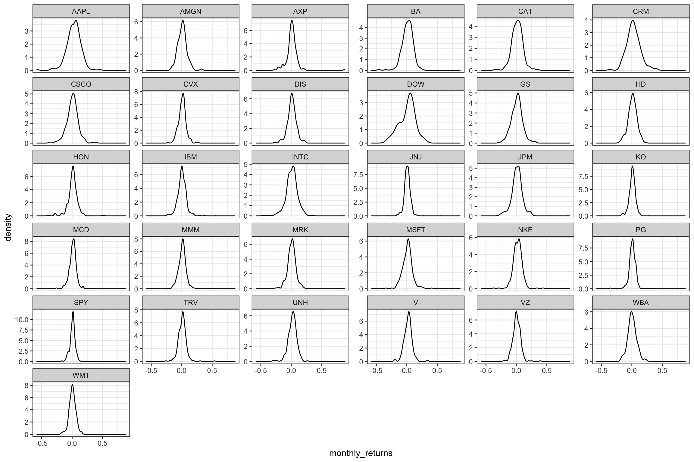
What can you infer from this plot? Which stock is the riskiest? The least risky?
The riskiest stocks are those where we have huge volatility, which implies a round-shaped curve. The Steeper the increase and decrease of the curve, the less risky the stock, as the monthly return of the stock is quite constant. In our opinion APPL is the riskiest, but this does not come as surprise if we look at its risk reward (highest risk, highest median reward in the years 2017-2020). However, the DOW is the riskiest and least risky is SPY.
Finally, produce a plot that shows the expected monthly return (mean) of a stock on the Y axis and the risk (standard deviation) in the X-axis. Please use ggrepel::geom_text_repel() to label each stock with its ticker symbol
p3 <- ggplot(returns2017, aes(x=sd, y=mean, label=symbol))+
      geom_point(color="red")+
      labs(title="Risk-Reward Plot 2017-2020", y="Expected Monthly Return", x="Risk" )+
      ggrepel::geom_text_repel()+
      geom_smooth(method=lm)

p3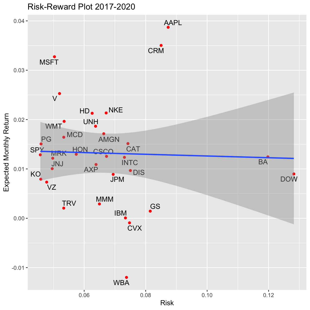
p4 <- ggplot(returns2000, aes(x=sd, y=mean, label=symbol))+
      geom_point(color="blue")+
      labs(title="Risk-Reward Plot 2000-2020", y="Expected Monthly Return", x="Risk" )+
      ggrepel::geom_text_repel()+
      geom_smooth(method=lm)
      NULL
## NULLp4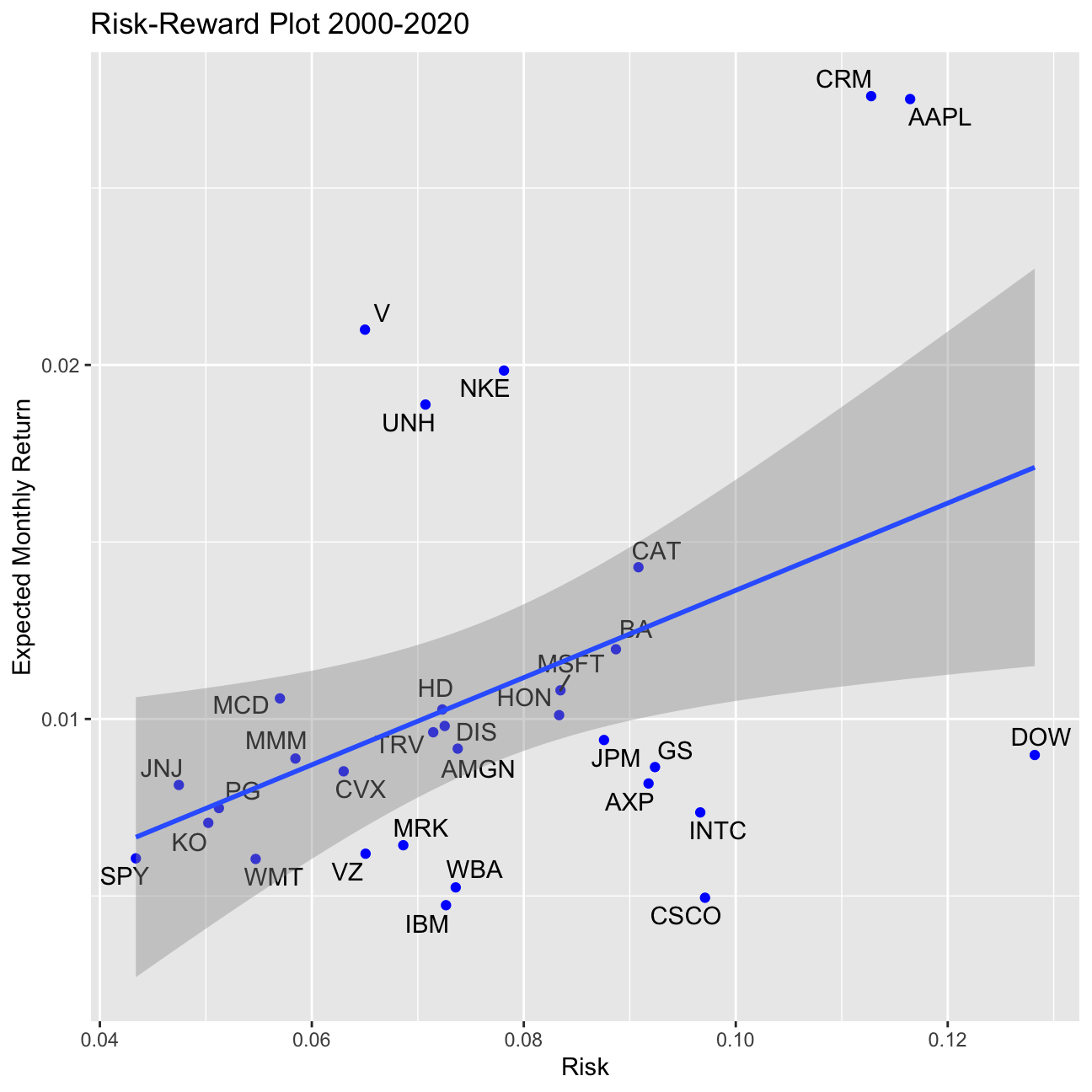
What can you infer from this plot? Are there any stocks which, while being riskier, do not have a higher expected return?
Risk Reward Graph: We can see from the graph that there is an overall trend for higher returns having higher risk. However, we shall not forget that we are looking here at Risk Rewards for a period of only 3 years, which in a stock life is neglectable. In the second chunck of the code we produce the same graph but with more data. Here our pricing data starts in 2000 (in case a stock was introduced later to the DOW Jones Industrial Average, from the beginning of the stock’s lifecycle). Here we can more clearly see our reasoning. The fact that the DOW is “high” risk, is because it is not an actual stock, but rather the index, that is comprised of all the 30 stocks in the index, and as we have outliers in our 30 companies (some that produce higher returns with lower risk, and other that are considered high risk but only have small returns) we arrive at the conclusion that is the reason why the DOW is so much to the right.