Yield Curve Inversion

library(tidyverse)  # Load ggplot2, dplyr, and all the other tidyverse packages
library(mosaic)
library(ggthemes)
library(GGally)
library(readxl)
library(here)
library(skimr)
library(janitor)
library(broom)
library(tidyquant)
library(infer)
library(openintro)
library(tidyquant)
library(scales)
Every so often, we hear warnings from commentators on the “inverted yield curve” and its predictive power with respect to recessions. An explainer what a inverted yield curve is can be found here. If you’d rather listen to something, here is a great podcast from NPR on yield curve indicators
In addition, many articles and commentators think that, e.g., Yield curve inversion is viewed as a harbinger of recession. One can always doubt whether inversions are truly a harbinger of recessions, and use the attached parable on yield curve inversions.
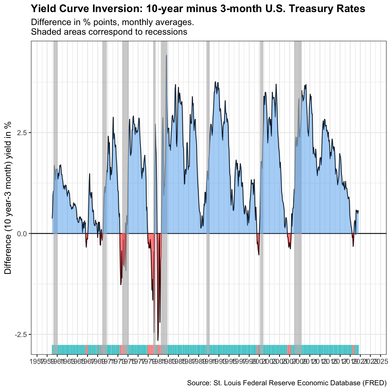
In our case we will look at US data and use the FRED database to download historical yield curve rates, and plot the yield curves since 1999 to see when the yield curves flatten. If you want to know more, a very nice article that explains the yield curve is and its inversion can be found here. At the end of this chllenge you should produce this chart

First, we will use the tidyquant package to download monthly rates for different durations.
# Get a list of FRED codes for US rates and US yield curve; choose monthly frequency
# to see, eg., the 3-month T-bill https://fred.stlouisfed.org/series/TB3MS
tickers <- c('TB3MS', # 3-month Treasury bill (or T-bill)
             'TB6MS', # 6-month
             'GS1',   # 1-year
             'GS2',   # 2-year, etc....
             'GS3',
             'GS5',
             'GS7',
             'GS10',
             'GS20',
             'GS30')  #.... all the way to the 30-year rate

# Turn  FRED codes to human readable variables
myvars <- c('3-Month Treasury Bill',
            '6-Month Treasury Bill',
            '1-Year Treasury Rate',
            '2-Year Treasury Rate',
            '3-Year Treasury Rate',
            '5-Year Treasury Rate',
            '7-Year Treasury Rate',
            '10-Year Treasury Rate',
            '20-Year Treasury Rate',
            '30-Year Treasury Rate')

maturity <- c('3m', '6m', '1y', '2y','3y','5y','7y','10y','20y','30y')

# by default R will sort these maturities alphabetically; but since we want
# to keep them in that exact order, we recast maturity as a factor
# or categorical variable, with the levels defined as we want
maturity <- factor(maturity, levels = maturity)

# Create a lookup dataset
mylookup<-data.frame(symbol=tickers,var=myvars, maturity=maturity)
# Take a look:
mylookup %>%
knitr::kable()| symbol | var | maturity |
|---|---|---|
| TB3MS | 3-Month Treasury Bill | 3m |
| TB6MS | 6-Month Treasury Bill | 6m |
| GS1 | 1-Year Treasury Rate | 1y |
| GS2 | 2-Year Treasury Rate | 2y |
| GS3 | 3-Year Treasury Rate | 3y |
| GS5 | 5-Year Treasury Rate | 5y |
| GS7 | 7-Year Treasury Rate | 7y |
| GS10 | 10-Year Treasury Rate | 10y |
| GS20 | 20-Year Treasury Rate | 20y |
| GS30 | 30-Year Treasury Rate | 30y |
df <- tickers %>% tidyquant::tq_get(get="economic.data",
                   from="1960-01-01")   # start from January 1960

glimpse(df)
## Rows: 6,774
## Columns: 3
## $ symbol <chr> "TB3MS", "TB3MS", "TB3MS", "TB3MS", "TB3MS", "TB3MS", "TB3MS",…
## $ date <date> 1960-01-01, 1960-02-01, 1960-03-01, 1960-04-01, 1960-05-01, 1…
## $ price <dbl> 4.35, 3.96, 3.31, 3.23, 3.29, 2.46, 2.30, 2.30, 2.48, 2.30, 2.…Our dataframe df has three columns (variables):
symbol: the FRED database ticker symboldate: already a date objectprice: the actual yield on that date
The first thing would be to join this dataframe df with the dataframe mylookup so we have a more readable version of maturities, durations, etc.
yield_curve <-left_join(df,mylookup,by="symbol") Plotting the yield curve
This may seem long but it should be easy to produce the following three plots
Yields on US rates by duration since 1960

#Plotting the graph with years on the x-axis and yields on the y-axis
ggplot(yield_curve, aes(x = date, y = price, color = maturity)) +
#Facet_wrapping by maturity and var since the levels of maturity are ordered
    facet_wrap(maturity ~ var, ncol = 2) +
#Choosing the plot type to be a line graph
    geom_line() +
#Black and white theme
    theme_bw() +
#Setting the x-axis labels to be in date format in years
    scale_x_date(labels=date_format("%Y")) +
#Removing legend and bolding plot title
    theme(legend.position = "none", plot.title = element_text(face = "bold")) +
#Setting plot and axis titiles
labs(y = '%', title = 'Yields on U.S. Treasury rates since 1960', caption = "Source: St. Louis Federal Reserve Economic Database (FRED)", x = "") 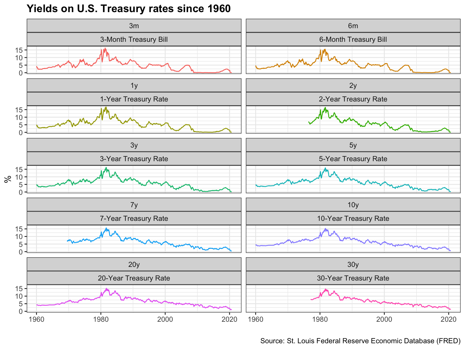
Monthly yields on US rates by duration since 1999 on a year-by-year basis

#Creating new data frame with years >= 1999 and new year and month variables
yield_curve_with_years <- yield_curve %>%
  filter(date>="1999-01-01") %>%
   mutate(year = year(date), month = month(date))

#Plotting the graph with the different maturities on x-axis, yields on y-axis and grouping the yields by month
ggplot(yield_curve_with_years, aes(x = maturity, y = price, color = year, group = month)) +
#Facet wrap the plot by year
    facet_wrap(~year, ncol = 4) +
#Choosing the plot to be a line graph
    geom_line() +
#Choosing a black and white theme
    theme_bw() +
#Removing plot legend
    theme(legend.position = "none") +
#Setting plot labels
    labs(y = 'Yield (%)', title = 'US Yield Curve', caption = "Source: St. Louis Federal Reserve Economic Database (FRED)", x = "Maturity") +
#Bolding plot title
    theme(plot.title = element_text(face = "bold"))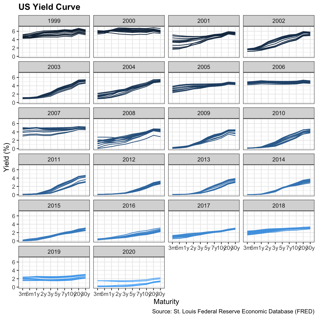
3-month and 10-year yields since 1999

#Creating new data frame with only 3m Treasury Bill and 10y Treasury Note, and years since 1999
yield_curve_3m_10m <- yield_curve %>%
  filter(date>="1999-01-01", (maturity == "3m" | maturity == "10y"))

#Plotting graph with date on the x-axis and yields on the y-axis, colors grouped by var
ggplot(yield_curve_3m_10m, aes(x = date, y = price, color = var)) +
#Choosing plot to be a line graph
    geom_line() +
#Choosing black and white theme
    theme_bw() +
#Removing legend title and bolding plot title
    theme(legend.title = element_blank(), plot.title = element_text(face = "bold")) +
#Setting plot and axis titles
    labs(y = '%', title = 'Yields on 3-month and 10-year US Treasury rates since 1999',
         caption = "Source: St. Louis Federal Reserve Economic Database (FRED)", x = "") +
#Setting x-axis labels to be in 5 year increments
    scale_x_date(date_breaks="5 years",labels=date_format("%Y"), limits = c(as.Date("1999-01-01"),NA))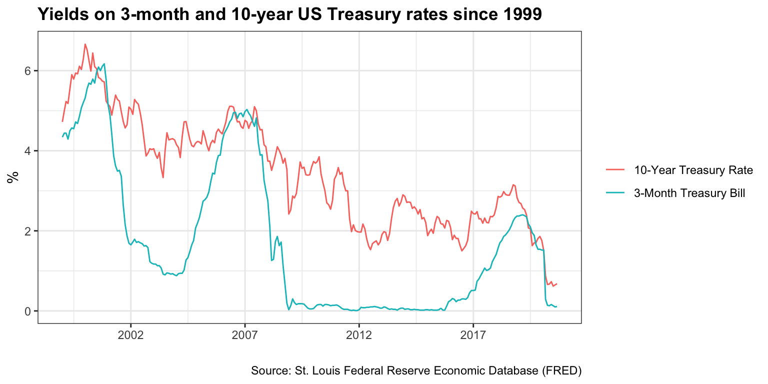
According to Wikipedia’s list of recession in the United States, since 1999 there have been two recession in the US: between Mar 2001–Nov 2001 and between Dec 2007–June 2009. Does the yield curve seem to flatten before these recessions? Can a yield curve flattening really mean a recession is coming in the US? Since 1999, when did short-term (3 months) yield more than longer term (10 years) debt?
Besides calculating the spread (10year - 3months), there are a few things we need to do to produce our final plot
- Setup data for US recessions
- Superimpose recessions as the grey areas in our plot
- Plot the spread between 30 years and 3 months as a blue/red ribbon, based on whether the spread is positive (blue) or negative(red)
- For the first, the code below creates a dataframe with all US recessions since 1946
# get US recession dates after 1946 from Wikipedia
# https://en.wikipedia.org/wiki/List_of_recessions_in_the_United_States

recessions <- tibble(
  from = c("1948-11-01", "1953-07-01", "1957-08-01", "1960-04-01", "1969-12-01", "1973-11-01", "1980-01-01","1981-07-01", "1990-07-01", "2001-03-01", "2007-12-01"),
  to = c("1949-10-01", "1954-05-01", "1958-04-01", "1961-02-01", "1970-11-01", "1975-03-01", "1980-07-01", "1982-11-01", "1991-03-01", "2001-11-01", "2009-06-01")
  )  %>%
  mutate(From = ymd(from),
         To=ymd(to),
         duration_days = To-From)

recessions
## # A tibble: 11 x 5
## from to From To duration_days
## <chr> <chr> <date> <date> <drtn>
## 1 1948-11-01 1949-10-01 1948-11-01 1949-10-01 334 days
## 2 1953-07-01 1954-05-01 1953-07-01 1954-05-01 304 days
## 3 1957-08-01 1958-04-01 1957-08-01 1958-04-01 243 days
## 4 1960-04-01 1961-02-01 1960-04-01 1961-02-01 306 days
## 5 1969-12-01 1970-11-01 1969-12-01 1970-11-01 335 days
## 6 1973-11-01 1975-03-01 1973-11-01 1975-03-01 485 days
## 7 1980-01-01 1980-07-01 1980-01-01 1980-07-01 182 days
## 8 1981-07-01 1982-11-01 1981-07-01 1982-11-01 488 days
## 9 1990-07-01 1991-03-01 1990-07-01 1991-03-01 243 days
## 10 2001-03-01 2001-11-01 2001-03-01 2001-11-01 245 days
## 11 2007-12-01 2009-06-01 2007-12-01 2009-06-01 548 days- To add the grey shaded areas corresponding to recessions, we use
geom_rect() - to colour the ribbons blue/red we must see whether the spread is positive or negative and then use
geom_ribbon(). You should be familiar with this from last week’s homework on the excess weekly/monthly rentals of Santander Bikes in London.
#Creating new data frame with only 3m and 10y maturities, pivoting wider and creating a new variable difference
yield_curve_final <- yield_curve %>%
  filter((maturity == "3m" | maturity == "10y")) %>%
  select(c("date","price","var")) %>%
  pivot_wider(names_from = "var", values_from = "price") %>%
  mutate(difference=`10-Year Treasury Rate` - `3-Month Treasury Bill`)

#Plotting graph with date on the x-axis and the difference on the y-axis
ggplot(yield_curve_final, aes(x=date, y=difference)) +
#Choosing plot to be a line graph
  geom_line() +
#Creating title and labels for graph
    labs(y = 'Difference (10 year-3 month) yield in %', title = 'Yield Curve Inversion: 10-year minus 3-month U.S. Treasury Rates',
      caption = "Source: St. Louis Federal Reserve Economic Database (FRED)",
      subtitle = "Difference in % points, monthly averages. \nShaded areas correspond to recessions", x="") +
#Selecting black and white theme
  theme_bw() +
#Fixing x-axis labels and limits
  scale_x_date(date_breaks="2 years",labels=date_format("%Y"), limits = c(as.Date("1959-01-01"),as.Date("2023-01-01"))) +
#Bolding plot title and removing legend
  theme(plot.title = element_text(face = "bold"), legend.position = "none") +
#Creating y-intercept line at 0
  geom_hline(yintercept=0,color="black") +
#Creating rugs at bottom of plot
  geom_rug(aes(colour=ifelse(difference >= 0,"steelblue2","red")), sides="b",alpha=0.5, position = "jitter") +
#Plotting the recession grey areas on plot
  geom_rect(data=filter(recessions), inherit.aes=F, aes(xmin=From, xmax=To, ymin=-Inf, ymax=+Inf), fill='grey', alpha=0.7) +
#Plotting graph ribbons
  geom_ribbon(aes(ymin = difference, ymax = pmin(difference, 0)), fill= "steelblue2", alpha=0.5) +
  geom_ribbon(aes(ymin = 0, ymax = pmin(difference, 0)),fill = "red", alpha=0.5)